

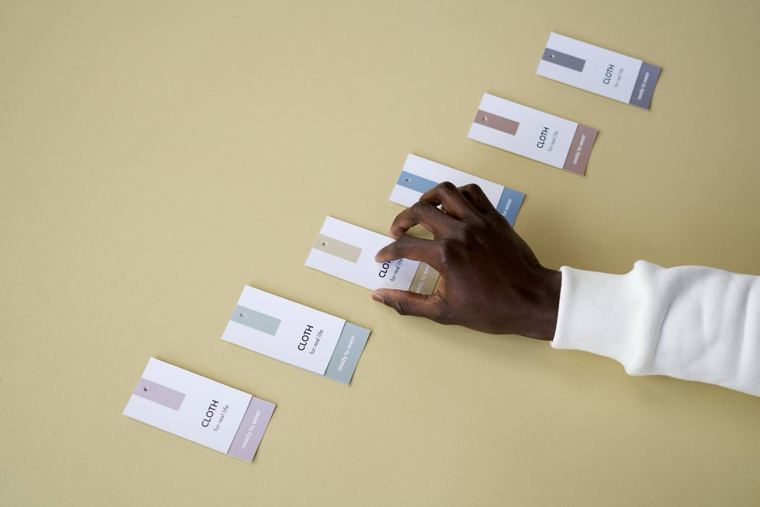
Here's the thing about a genuinely good outfit: every piece was chosen on purpose, and from across the room it reads as one look, not a costume assembled in the dark. That's what a real brand identity is supposed to do too. And here's the thing about most businesses we meet for the first time: they're wearing three different decades at once and nobody's told them yet. [Gently. We tell them gently.]
A brand audit is just the process of laying every piece out on the bed, so to speak, and being honest about what actually matches.
The Signs You're Probably Overdue for One
You don't need a formal audit to know something's off. Usually the signs have been sitting in your own folders the whole time, quietly multiplying. Pull up your logo file right now. Is there exactly one, and do you know for certain it's the current one? [If you just opened three different folders to check, that's data.] A lot of businesses are carrying around a "final_v2_FINAL_useThisOne.png" situation and have simply made peace with it.
The other giveaway is color. Not "we have a color," everyone has a color, but whether that color is the same color everywhere. Your website blue and your Instagram blue and your business card blue should be identical, not three cousins who resemble each other at a family reunion.
Your Logo Might Be Doing Too Much, or Too Little
There are two ways a logo goes wrong, and they're basically opposites. Some are blurry and pixelated, usually because the only file anyone can find is a screenshot of a screenshot from six years ago [a logo that has been through the digital equivalent of a very long road trip]. Others are the reverse problem: so detailed, so many little flourishes and gradients and tiny text, that shrunk down to a favicon it becomes an abstract smudge. A good logo has to work at the size of a thumbnail and the size of a billboard, and if it only works at one of those, that's worth knowing before you build an entire identity around it.
Your Colors and Fonts Aren't Actually a Family
This is the part I could talk about for genuinely too long, so I'll try to be disciplined. A real brand palette isn't "colors we like," it's a small, deliberate set that gets used the exact same way every single time, the way a well-edited closet has pieces that all go together instead of forty things that each only pair with one other thing.
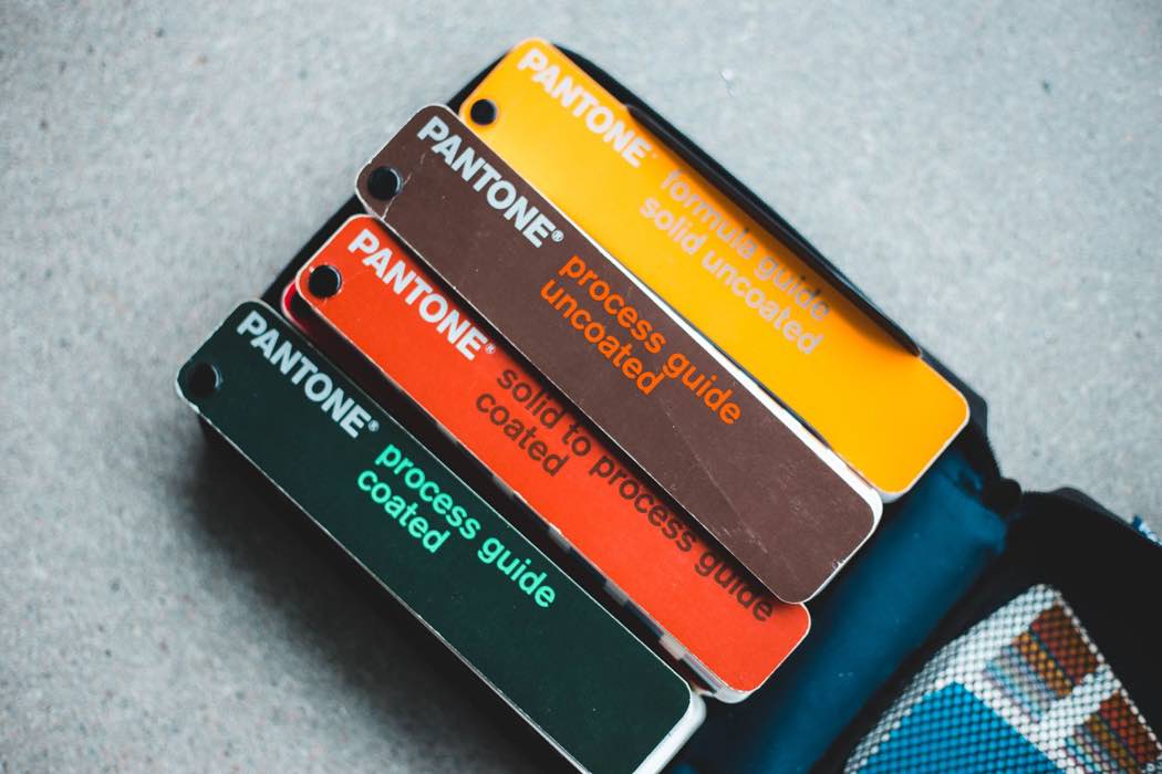
Same goes for fonts. Two, maybe three, used consistently everywhere, is a system. Five different fonts because five different people touched five different documents over five different years is not a system, it's an accident that happened slowly. And a study from Lucidpress and Demand Metric found companies with consistently presented branding saw revenue climb by up to 33%, based on surveyed brand managers rather than audited financials, but the direction of that finding lines up with everything we see in practice.
What we see in the field
This is the pattern across nearly every audit we've done, not one specific client: a business that's grown for years without anyone stepping back to look at the whole identity at once. Multiple logo versions with nobody sure which is current. Colors that were never actually built as a matching set. Old logos too blurry or too busy to hold up at small sizes. None of it happened on purpose. It just happened, one decision at a time, the way most things do.
None of this means your current identity is a disaster, most of the time it just means nobody's laid all the pieces out on the bed together in a few years [do this literally, if you have printed materials lying around, it's oddly clarifying]. A brand audit is just that moment, on purpose, before you build anything new on top of pieces that were never actually a matching set to begin with.
If you want a second, trained set of eyes on your logo, colors, fonts, and messaging, that's exactly the kind of audit we build into our Strategy Sessions, ready when you are.