
We moved into a new house not long ago, and if you've ever done that, you know the specific chaos of a hundred boxes sitting in every room like modern art nobody signed up for. [Our labeling system involved writing "misc" on roughly forty percent of them, which tells you everything about how that process went.] What I love about that stage, somewhere between exhausting and genuinely thrilling, is standing in a brand-new room holding a lamp you've owned for six years and asking it, out loud, where it belongs now.
That's basically what a website redesign is. Same pieces you already love, a whole new room to imagine them in.
Your Message Finally Comes Through
Most websites don't start out confusing. They get that way slowly, the same way a junk drawer starts as one spare key and ends as an archaeological dig. [Taylor has one of these in real life. I've seen it. I've said nothing, until now, apparently, in a public blog post.] A page gets added here, a service gets renamed there, someone's cousin adds a popup in 2019 and nobody's touched it since. Five years later, a brand-new visitor lands on the homepage and genuinely cannot tell what the business does.
A redesign forces the question nobody wants to sit with: can a total stranger tell what you do, and who it's for, without scrolling three times and squinting? That's not a design problem, not really - it's a clarity problem wearing a website as a costume. Fixing it usually means fewer words, not more, which is its own kind of humbling when you've spent years adding sentences instead of cutting them.
The Whole Thing Finally Makes Sense
This is genuinely my favorite part, if I'm being honest, because it's basically moving day all over again. Everything comes out of the boxes at once, gets looked at without the sentimentality that talks you into keeping something that stopped earning its spot years ago, and only what's actually worth carrying gets set back down, somewhere a first-time guest would find it on their own.
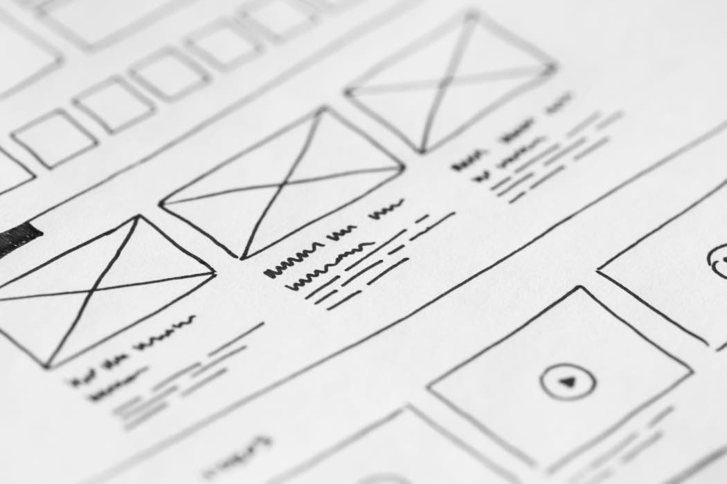
That's structure, in the boring-but-important sense: a homepage that makes the next click obvious, a navigation menu that doesn't require a treasure map, pages that build on each other instead of competing for attention. Nobody screenshots good site structure and posts it anywhere. They just quietly stop getting lost, which, if you've ever watched someone visibly give up trying to find your pricing page, is the whole ballgame.
People Can Actually Find You
This part is really Taylor's department [he handles SEO, I handle whether the buttons look like buttons], but even I've absorbed enough by osmosis to know it matters just as much as anything I do. A cleaner structure and clearer content aren't just nicer for a human. They're easier for Google, and increasingly for AI search tools, to actually understand and surface. A gorgeous site that's structurally a mess is still, to a search engine, kind of unreadable.
And speed plays into this more than people expect. Google's own research found 53% of mobile visitors abandon a page that takes longer than three seconds to load. Old sites accumulate weight the same way that junk drawer does - years of uncompressed images and outdated code nobody ever goes back to clean up. A redesign is the natural moment to rebuild that clean.
It Finally Feels Trustworthy
There's research on this that I genuinely love, because it confirms something I've believed since long before I could cite it: people form an opinion about a website's appeal in about 50 milliseconds. Fifty. That's faster than you can finish reading this sentence out loud. Consistent fonts, colors, and a voice that sounds like one business instead of three different decades of one business - that's not vanity, that's the first, fastest signal a visitor gets about whether to trust you with their email address, let alone their money.
What we see in the field
This is the pattern across the redesigns we've done, not just one of them: a site grows the way most do, a little at a time over years, until even the owner can't confidently walk a stranger through it. After launch, the message finally comes through, the pages land in an order that matches how people actually think about the business, and the client tells us it's noticeably easier for people to find them.
None of this means your current site is bad, or that you did something wrong by not touching it in years [nobody unpacks the same boxes twice for fun, that's not a real hobby anyone has]. It's the same feeling as the week after a move when the last box finally breaks down and the lamp is exactly where it should be: less about chasing trends, more about giving the pieces you already love a room that actually fits them.
If your site has quietly turned into a junk drawer and you're ready for someone to go through it with you, that's exactly what our Website Design & Redesign Services are built for.